Designers are often regarded as the visionaries who breathe life into ideas, translating abstract concepts into tangible, functional products. Whether it’s crafting a beautiful website, developing an intuitive app, or creating a brand identity that resonates, designers wield significant influence over how a product looks and feels. But there’s a critical pitfall that some designers fall into—a failure to see through the user’s eyes.
When a designer becomes too focused on their own creative process, aesthetic preferences, or internal goals, they can lose sight of the most important stakeholder in any project: the user. And when a design fails to serve its users, no matter how visually stunning or technically impressive it may be, it’s ultimately a failed design.
The Designer’s Blind Spot
Every designer wants to create something beautiful, unique, and memorable. It’s part of the creative drive, the passion that fuels innovation. But there’s a dangerous temptation that can come with that—designing for oneself rather than for the end user.
This “designer’s blind spot” happens when a designer gets so caught up in their own preferences, style, or vision that they forget who they’re actually designing for. It’s easy to get lost in the artistic process, but the end product isn’t for the designer—it’s for the user. When the focus shifts from solving user problems to showcasing design skills, the end result can become disconnected from what users truly need.
For example, a website with a cutting-edge, avant-garde layout might look incredible to a designer’s eye, but if the navigation is confusing or the user can’t easily find what they’re looking for, it’s a design that misses the mark. The user’s frustration will outweigh any appreciation for the visual aesthetics, and the purpose of the design—communicating clearly and delivering value—gets lost.
Prioritizing Form Over Function
One of the most common traps designers fall into is prioritizing form over function. This can manifest in many ways—whether it’s an overcomplicated interface, an unusual layout that’s hard to navigate, or a color scheme that looks great but compromises readability.
Design is often thought of as a balance between form and function, where the aesthetic and usability are equally important. But when form takes precedence over function, it becomes difficult for users to engage with the product, leading to frustration and abandonment.
Take for example mobile apps with complex animations. While visually impressive, these animations can slow down load times, causing friction in the user experience. A user, especially in today’s fast-paced digital landscape, may lose patience and switch to a competitor’s app that prioritizes speed and simplicity over visual flair.
A well-designed product is not one that simply looks good—it’s one that works seamlessly for the people who use it.
The Cost of Ignoring User Needs
Designers who fail to understand the user’s perspective risk more than just delivering a poor experience. They can compromise the success of the entire project. Users are the ultimate judges of a design’s effectiveness. They don’t care how much time or effort went into making something look beautiful; they care about whether it helps them accomplish their goals.
When users encounter friction, confusion, or frustration in a design, they don’t stick around to figure it out—they leave. And once they’re gone, they’re unlikely to return.
For businesses, this can mean lost customers, lower engagement, and missed opportunities. A beautifully designed website that fails to convert visitors into buyers is a missed business objective. A sleek app that users find too complicated to navigate is a wasted investment.
Designers must understand that success is measured not by how impressive the design looks on their portfolio but by how well it serves the user’s needs and achieves the intended goals.
Putting the User First
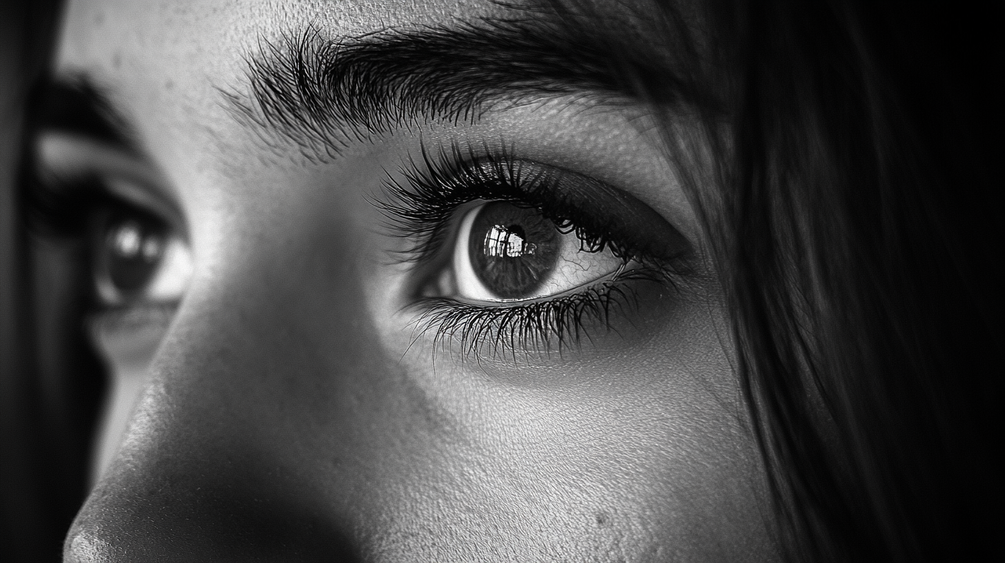
So, how can designers ensure they avoid this blind spot? It all starts with empathy—the ability to step outside of their own creative mindset and view the project from the user’s perspective.
- Understand the User’s Journey: Before diving into the design, take time to understand the user’s journey. What are their pain points? What problems are they trying to solve? What are their goals when using the product? This helps keep the focus on creating a design that addresses the user’s needs, rather than simply reflecting the designer’s preferences.
- Incorporate User Testing Early and Often: Involving real users in the design process is crucial. Conduct user testing early on to gather feedback on functionality, usability, and overall satisfaction. This helps identify issues that may not be obvious to the designer but are glaringly obvious to users.
- Balance Aesthetics with Usability: Striking the right balance between form and function is key. While it’s important to create something visually appealing, never let aesthetics get in the way of usability. Always ask: “Is this design helping the user achieve their goal, or is it adding unnecessary complexity?”
- Iterate and Adapt: Design is an iterative process. Be prepared to make adjustments based on user feedback. A design that may seem perfect in the conceptual stage can reveal flaws once users interact with it. Flexibility and a willingness to adapt are essential to creating a product that works for its audience.
- Communicate with Stakeholders: Collaboration with stakeholders—whether they’re business owners, developers, or marketing teams—can help keep the design aligned with the project’s goals. This ensures that the design isn’t just serving the user but also delivering on business objectives.
A Design That Serves the User is a Design That Works
At the end of the day, the success of a design is determined by how well it serves its users. Designers who fail to consider the user’s needs and preferences are missing the mark, no matter how visually impressive the final product may be.
The best designs are those that seamlessly blend aesthetics and usability. They solve problems, provide clear pathways, and create positive experiences for the people who use them. When designers make empathy and the user’s perspective their top priority, they create work that not only looks good but also functions beautifully.
Design is about more than just creating something visually appealing; it’s about understanding the human experience and crafting solutions that make people’s lives easier, better, and more enjoyable. When designers truly see through the user’s eyes, they unlock the full potential of their work—and that’s when design really shines.
Looking for top-tier UI/UX design? We’re proud to be ranked among the Top UI/UX Design Agencies in Kentucky!


